
This article includes gambling-related content. Irishblogs.ie is committed to providing accurate and responsible information. To ensure the highest standards of quality and safety, all gambling-related content is curated and verified by industry experts. Please engage responsibly!

Why casino UX deserves the same scrutiny as any consumer app
Interface design in gambling is not decoration. Every screen in a casino product encodes decisions about what the operator wants you to do next, and those decisions have sharper consequences than they do in a podcast app. A "continue watching" rail that keeps you bingeing a series costs you sleep; a "continue playing" rail costs you money at a mathematically guaranteed rate. That asymmetry is why UX choices in this category deserve real scrutiny rather than a shrug.
It is also why the category is genuinely interesting to study. Casino products iterate fast, copy each other shamelessly, and operate under regulatory constraints that most consumer apps never encounter — age verification, affordability signals, mandatory safer-gambling tooling, advertising restrictions that vary by country. The result is a strange hybrid: growth-hacked consumer software wearing a compliance harness. Where the harness sits loosely, the growth patterns dominate. Where regulators have pulled it tight, you can watch the design change shape in real time.
Onboarding and the shortest form in consumer software
The modern casino registration flow is a study in friction engineering. The industry learned long ago that every additional field on a sign-up form loses a measurable share of prospects, so the first screen is nearly always minimal: email, password, sometimes a phone number. Name, address and date of birth follow on a second step, because they must — you cannot legally gamble anonymously in any regulated market — but the sequencing is deliberate. Commitment first, paperwork second.
The most consequential design decision in onboarding is not the form at all, though. It is where identity verification sits in the journey. Broadly, the industry has used two patterns. The first defers KYC — the identity and document checks — until the moment a player tries to withdraw. This makes joining feel effortless and is the pattern players complain about most, because it moves all the friction to the moment they are owed money. The second pattern, increasingly the norm in tightly regulated markets, verifies identity up front, before or immediately after the first deposit. It is more friction at the door, and it is unambiguously the better design for the player: whatever checks are going to happen should happen before money is on the table, not after.
A reader can learn a lot about an operator's priorities from this single choice. Verification placed early signals a product built to satisfy a regulator watching closely. Verification placed at withdrawal signals a funnel built to maximise deposits. Neither observation requires knowing anything else about the company — the design itself is the disclosure.
The other onboarding element worth noticing is the deposit-limit prompt. Well-designed products now ask you to set a deposit limit during registration, as a step in the flow rather than a setting buried three menus deep. Where that prompt appears — and whether it defaults to "no limit" — tells you whether safer gambling is a design requirement or a legal checkbox.
Lobby architecture and how games are merchandised
Open any contemporary casino lobby and you are looking at a storefront that borrows its grammar from streaming platforms: a hero banner, then horizontally scrolling rails — "Popular now", "New releases", "Recently played", "Recommended for you". This is not coincidence. The rail layout solved the same problem for video that casinos have with games: a catalogue of thousands of near-substitutable items, a user who will only ever sample a fraction of them, and a business need to direct attention rather than merely list inventory.
The rails are ranked, and the ranking is commercial. Position in a casino lobby is merchandising space, shaped by which games hold players longest, which are being promoted by their studios, and which the operator has an interest in surfacing that week. "Popular" rarely means a raw play-count; it means popular, weighted by what the operator would like to be popular. Again — the same is true of every streaming home page, but the stakes differ.
Two patterns deserve particular attention because they work quietly. The first is the "recently played" rail, which is the single most effective retention device in the lobby: it collapses the distance between opening the site and resuming the exact behaviour you left off. The second is infinite scroll in game categories, which removes the natural stopping point that pagination used to provide. Neither pattern is unique to gambling, and both are more consequential inside it. A thoughtfully designed product uses the first and is sparing with the second; a growth-at-all-costs product leans on both.
Why Two Slots With the Same RTP Feel Completely Different
Search, filters and the metadata problem
A catalogue of several thousand games is only as useful as its metadata, and this is where casino products vary most in quality. The baseline is a search box that matches on title and a filter by studio. The better implementations go much further: filtering by mechanic, by theme, and — most usefully — by volatility, the property that determines whether a game pays small and often or rarely and large.
Volatility labelling is the most player-relevant piece of metadata a lobby can expose, because it lets someone match a game to their bankroll and temperament before they stake anything. Products that surface it prominently, alongside each game's published return-to-player figure, are making an editorial choice in the player's favour: they are giving you the information that changes how long your money lasts. Products that hide both behind an info icon, or omit them entirely, have made the opposite choice. When we evaluate any casino interface, this is one of the first things we look for — not because a single label matters enormously, but because it is a reliable proxy for whom the design is serving.
Demo or free-play mode belongs in the same conversation. Letting a player learn a game's rhythm without staking real money is good design and good practice; markets differ on whether and when demo play may be offered, but where it exists, its prominence is another honest signal of design intent.
Mobile play and the disappearing app
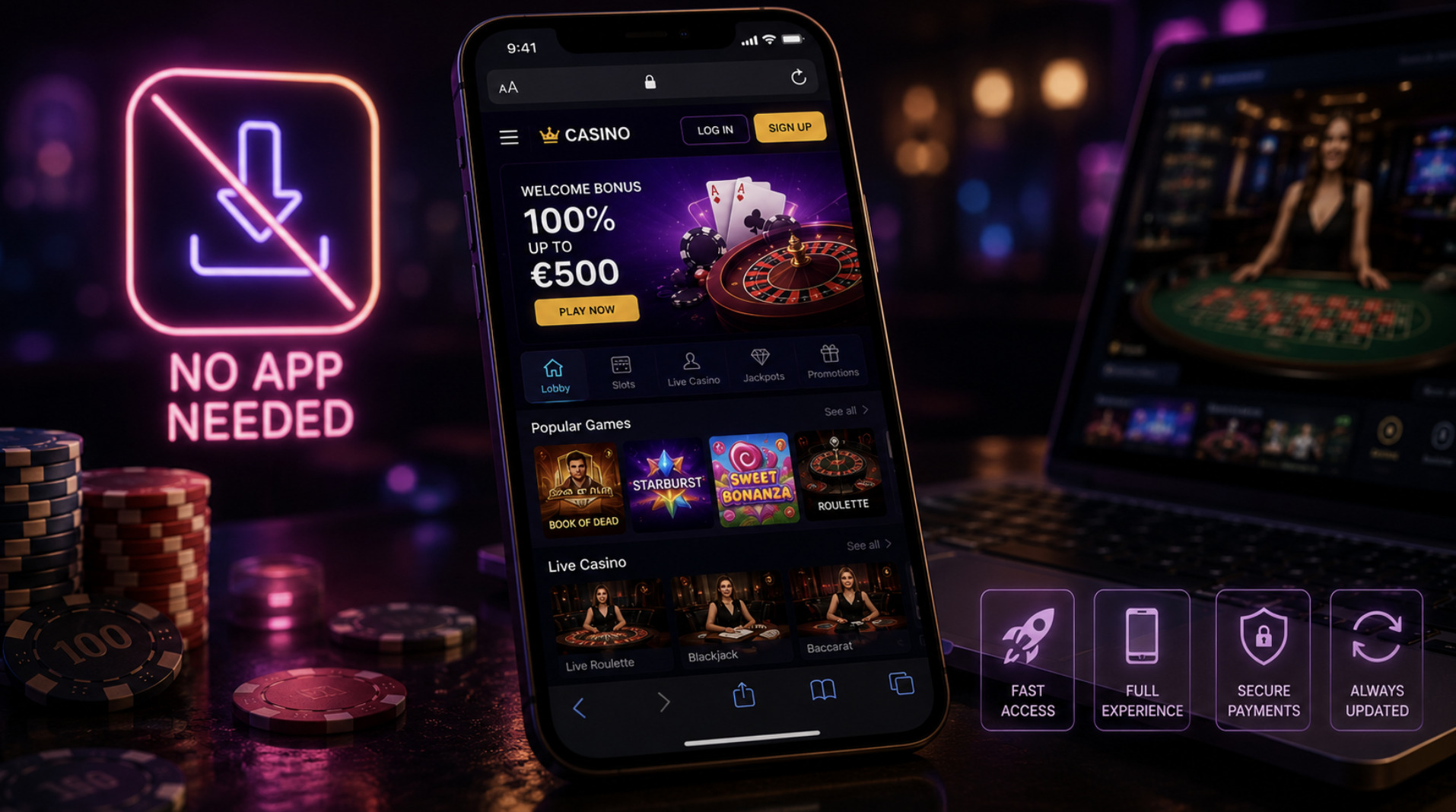
The most visible shift in casino UX over the past decade is that the native app has quietly stopped being the point. The modern pattern is a browser-based, mobile-first web product — effectively a progressive web app — that runs the full catalogue, the full payment stack and the account area without a download. There are pragmatic reasons for this: app-store policies around real-money gambling are restrictive and vary by country, review cycles slow down iteration, and store commissions are unwelcome. But the deeper reason is that the mobile web caught up. Streaming a live dealer table in a phone browser works now, and once it works, the app is overhead.
For the player, browser delivery cuts both ways, and it is worth being clear-eyed about each direction. The benefit is convenience without clutter — nothing to install, nothing to update. The cost is that friction, once again, has been removed — and in this category friction is not always your enemy. An app you must consciously download is a small commitment device; a bookmark is not. The "add to home screen" prompt that mobile casino sites now display is a deliberate attempt to recover the app's one retention advantage — an icon in your daily field of vision — without accepting any of the app store's oversight.
Judged purely as engineering, the good implementations are impressive: sub-second lobby loads on mid-range phones, layouts that reflow for one-handed portrait play, live video that degrades gracefully on weak connections. Judged as behavioural design, the same qualities read differently. Speed is a retention feature. Both readings are true at once, which is rather the theme of this entire category.
Payments as a user experience layer
Payment integration is where casino UX has converged hardest with mainstream fintech. The contemporary deposit flow is built around the same primitives as any e-commerce checkout — stored cards, e-wallets, one-tap mobile payments, open-banking transfers — and the design goal is identical: reduce the number of seconds and decisions between intent and completed transaction.
It succeeds. A deposit that once meant typing a card number now takes a thumbprint. And here more than anywhere else, the interests of the product and the player diverge, because every second removed from the deposit flow is a second in which a decision does not get reconsidered. This is precisely why regulators in several markets have intervened in payment UX directly — banning credit-card gambling, mandating deposit-limit prompts, requiring cooling-off friction that the funnel would never volunteer on its own.
Withdrawals are the other half of the story, and the half that reveals more. A product that processes withdrawals with the same one-tap ease as deposits — no gratuitous pending windows, no "reverse withdrawal" button inviting you to cancel a cash-out and keep playing — is showing you symmetric design: money moves out as easily as it moves in. Asymmetry here, where depositing is instant but withdrawing is an obstacle course, is the single most telling UX pattern in the entire product. The reverse-withdrawal button in particular has been banned in some regulated markets, for the excellent reason that its only function is to convert money a player had decided to take off the table back into stakes.
The responsible gambling toolkit and where it lives
Every regulated casino product now ships a safer-gambling toolkit: deposit, loss and session limits, reality-check reminders, time-outs, and self-exclusion. Listing the tools, however, says little — what differentiates products is placement and defaults, the two things interface design actually controls.
The weak pattern places the toolkit behind a small footer link, unstyled and unloved, satisfying the letter of an obligation. The strong pattern weaves it into the primary flows: a limit prompt inside registration, a persistent session clock on screen while playing, reality checks that interrupt gently but visibly, an account menu where "your limits" sits beside "your balance" rather than five layers down. The strongest pattern of all is good defaults — an account that starts with a conservative limit the player must consciously raise, rather than no limit the player must consciously impose.
Friction, used deliberately, is a feature here. The same designers who can strip every needless second from a deposit flow are equally capable of inserting a pause where a pause protects the player. Whether they have been asked to is, once again, visible in the interface itself. When reading any casino product, we would suggest looking at the safer-gambling layer first, not last: nothing else in the interface tells you as much, as quickly, about how the operator weighs its two competing incentives.
Ireland's New Gambling Laws Explained and What They Mean for Players
What polish can and cannot tell you
There is a conclusion this entire analysis has been building toward, and it is a warning as much as a summary: interface quality and operator quality are different things, and the gap between them is where players get hurt.
Everything described above — the frictionless onboarding, the streaming-grade lobby, the fintech payment stack, the mobile engineering — is available more or less off the shelf. White-label casino platforms mean that a small operation can present an interface every bit as polished as an industry leader's. Slick, in this category, is cheap. A beautiful product tells you that someone competent built the front end. It tells you nothing about the entity behind it, how it treats a large withdrawal, or what recourse you have if things go wrong — the things that actually determine whether a casino is safe to use, and which no amount of interface reading can establish.
So treat UX literacy as one lens, not a verdict. The design patterns in this piece will tell you what a product wants from you — where its funnel is greased and where its guardrails are real. They will never tell you whether the operator deserves your deposit. That question is answered by regulation and licensing, not by design, and it is a question worth answering before the interface gets any chance to impress you.
This article is general information about industry design practices, not gambling advice and not an endorsement of any operator. 18+. If gambling stops being fun, free and confidential support is available from GamCare and GambleAware.